17.7 x 11.3 x 2.8 cm
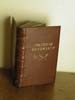
This was a re-bind of The Uses of Diversity, by G.K.Chesterton. It was one of a pair of Chesterton books that I gave my father (the other, All I Survey, did not need rebinding).
The binding was intended to be a bit rustic and primitive in feel, though the structure was based on the classic "fine binding". The original book was a standard hollow back with a cloth case cover. The paper was pleasantly thick and smelt of old books (but not mildew). It had a deckled fore edge and some discoloration on the tops of the pages. I decided not to recut the book block because I wanted to retain the deckle on the fore edges. And to recut the tops and leave the rest uncut would look funny. Besides, the margins were fairly narrow and I didn't want to make them look mean.
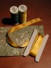
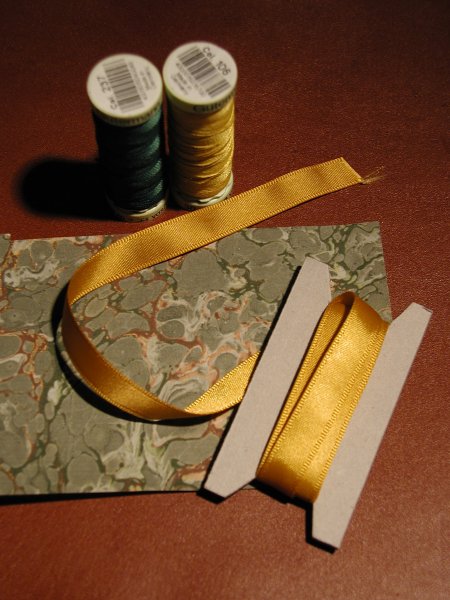 For the covering leather, I chose the largest of a selection of hide scraps and trimmings I obtained from Hewit's. The leather (not sure what kind) is a rich red-brown, strong and easy to pare. It has a slightly waxy finish, but is very forgiving of error. The color matches the dark red patches on my favourite green marbled paper. Picking up the gold from the endpapers to use in the headbands and marker ribbon gave us our full color palette: green, gold and red-brown.
I sewed the book on five exposed cords, rounded it, backed it, hand-sewed the headbands, and laced in the covers, all with very little trouble. The book block had a satisfying feel, nicely chunky and solid. Since the boards I was using were rather thick, I tried bevelling the edges. Unfortunately, my bevelling skills are not so hot, and the margin of bevel was a bit uneven. It was the harbinger of things to come.
Covering the book went smoothly. It was probably the last thing that did.
My first real problem was the endpapers. Endpapers for laced-on boards are problematic, because the paper has to wrap around the end of the cover before attaching to the book block. Glue it on too loosely, and the paper wrinkles at the hinge. Glue it on too tightly, and it tears (particularly if you move the cover with the glue still wet). I glued it on too tightly, and moved the cover too soon. The endpaper tore slightly at both hinges. And since the marbled paper is not a repeating pattern, I wasn't sure I could patch it adequately. I succeeded in the end by finding similar areas of pattern and cutting the edges along the wandering lines of marbling. The patches meld pretty well, though an experienced eye would pick them up immediately.
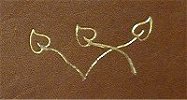
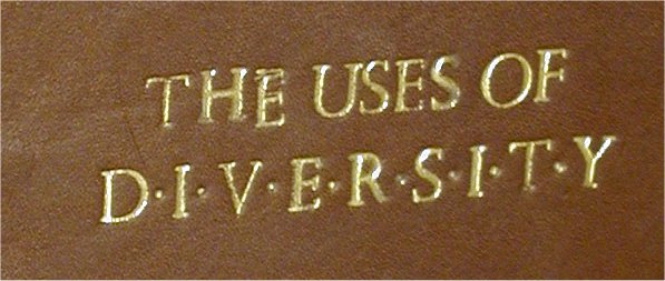
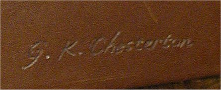
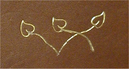
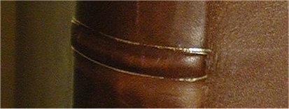
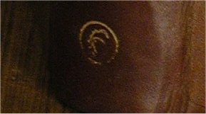
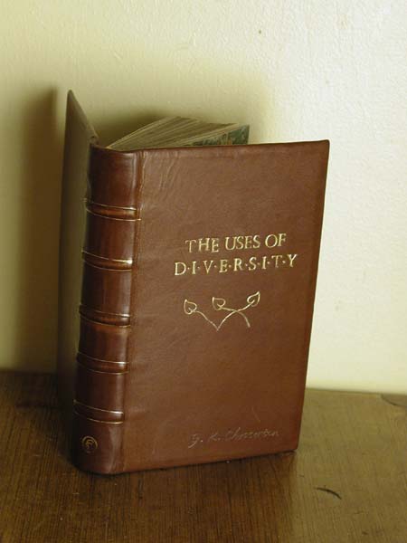 The final stage of binding this book was to decorate the covers. I had discussed the titling with my father while he was staying with us, but did not summon the courage to actually do it until over a month later, when my mother was visiting. The design was simple, with no titling information on the spine (I did not at that time have any type or handle letters small enough for spine work). I would, however, pick out the raised cords in gold. The front cover would have the title in 22 point Perpetua (my first set of handle letters), with the author's name in script below it somewhere. To do the script, I was going to use my foil writing tool (basically a heated stylus).
I was working with gold foil, which meant that I had to do the entire title in one go. Foil is too thick to sink into the impressions from any previous tooling. It's also opaque. So there is no hope of aligning any new markings with older ones, or doing your tooling in stages within the same area.
It was not an easy finishing experience.
 |
|
 |
|
 |
|
 |
|
 |
|
I had been using wheat paste to attach my endpapers, for good, sound structural reasons.
You need to paste something to the insides of the covers with the same adhesive as you use for the covering material, to balance out the warping forces. For me, that means using wheat paste somewhere on the inside of the book. When I was pasting down the board papers, I couldn't leave the book to stand open long enough for the hinges to dry properly, because the covers would warp with the moisture. The book needed to be in the press.
However, I am now pasting down a blank piece of card to fill in the inner cover within the leather turn-ins. That counteracts the pull of the cover without risking the hinges. Then, once the wheat paste has dried, I can then use a faster adhesive such as PVA to attach the endpapers. The PVA dries into the hinge fairly quickly, and doesn't warp the covers.
The finishing difficulties convinced me that it's time to learn gold tooling properly. Tooling with foil is supposed to be easier than tooling with gold leaf, which is why I started learning to finish that way. Ironically, the troubles I had with gold foil didn't discourage me from tooling. I didn't think, "That was the easier process and I still failed." What I thought was, "If I'm going to fail at tooling, I'd like to fail at the best tooling." So I've started learning to tool with gold leaf instead of foil.
However, you can't use a heated stylus for gold leaf tooling (probably a good thing, considering how much of my troubles were caused by my foil writing pen). This means that I am moving away from freehand tooling and starting to do more work with handle ornaments. I suspect this will prove fairly expensive unless I keep getting lucky on ebay.
Looking at the book, all I see are the mistakes. But my father, the intended recipient, loves the book anyway. All of the flaws that bother me are either invisible to him, or are signs of the handcrafted nature of the bookbinding.
I should get rid of all my failures this way.