

16 x 21.5 x 3.6 cm
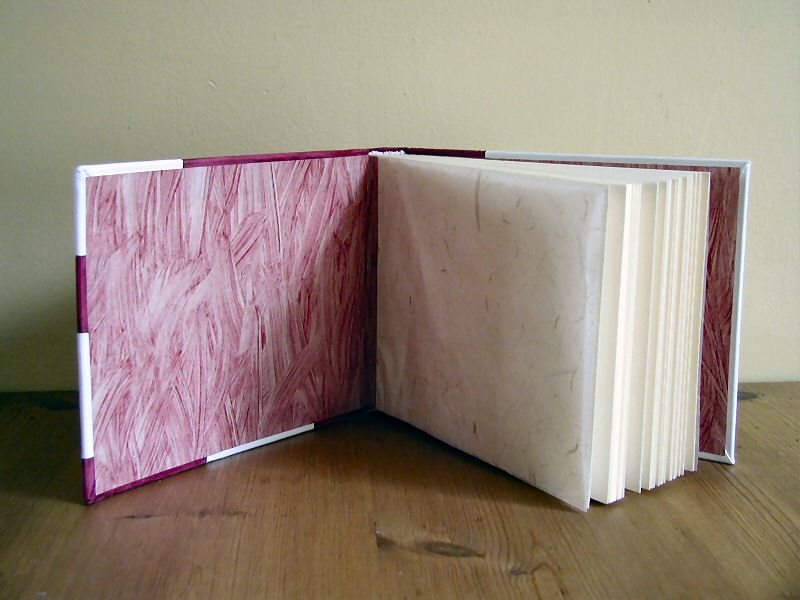
Photo album with beaded headband, bound library style with French grooves and tight back. Covered in white goatskin with back-pared onlays and inlays of reversed calf. Doblures of hand-painted paste paper, flyleaves of handmade Nepalese lokta tissue.
I have tried, over the past year, to give appropriately colored photo albums to some of our closest friends as they have had babies. It's been a bit of a baby boom lately, and I fell behind, with the result that this particular gift went to the house of a 6-month old rather than a newborn.
Olga is one of Martin's high school friends, whom I met in 1991. We reconnected with her and her husband Hans just before Martin's high school reunion, when she was 6 months pregnant. While we were over at their house for tea and vla (a Limburgs specialty, rather like an apple tart), I noticed that Hans is a gifted photographer. So a photo album seemed particularly appropriate.
I have had a quantity of white goatskin around for some time, from a batch that didn't work very well at Hewit's. The coloring on some of hides is spotty, and the finish is prone to peeling off when the leather is wet. With some practice, I've learned how to manage these problems. Now I value the stuff for some of its strengths (ease of paring, attractive texture, strong when dry).
Getting pink leather, however, has been a lot harder. Pink is an easy color to get wrong, so that it looks either obnoxiously bright or insipidly pale. (I don't particularly like pink anyway, except in baby girl clothes, so I'm difficult to please.) The rose-red calfskin on this album is the closest I could bear to come to it. It's from a lot of hides that dyed patchily on the front, but whose reverse (flesh) sides were smooth enough to make a good suede. It's intensely tactile stuff, but I am conscious that it will eventually go bald.
I am very attracted to letter forms in design, and to the use of the minimal amount of a subject to permit identification. So when I was thinking about a book for a girl named Renske, I hit on the idea of a binding using just enough of the letter R to allow the viewer to be sure of its identity. The font I chose was Arial Bold, the graceful descendant of the Bauhaus aesthetic movement in typography. I always associate the Netherlands with a modern design sensibility, so the non-traditional binding seemed to fit.
The first stage to the leatherwork was the inside of the loop of the R. For that element, which did not spill over the edges of the boards, I chose to use a back-pared onlay. This meant pasting the thinly-pared white shape onto the red calfskin before covering the book. I then shaved away the back of the red leather until the white lay flush. Then I pared the edges and pasted the leather up.
Only after the red calfskin was stuck to the book did I start working on the three inlays at the front. They all spill over the edges of the cover, and I was reluctant to have a back-pared onlay do that in case the bending caused it to peel.
I had created the design on bank paper (full sized). Transferring the curves to the leather on the book was simple, particularly with suede - a pointed bone folder was enough to make a mark through the paper. I then cut along those lines and peeled the leather off the boards.
Next, I checked that the leather pieces hadn't stretched out of shape during their removal from the boards by laying them on the bank paper design. They hadn't, so I used them as templates for cutting out the white leather inlays that would replace them. I had some trouble with the cutting - I need sharper scissors - but I ended up with three pieces that I could dry-fit into the gaps. I then pasted them up and stuck them down.
The back cover was just a straight-line inlay, hardly worth talking about.
The endpapers were also easy. I've been using this structure a lot on photo albums. First, I cut a piece of tissue for the flyleaf, making sure it's the size of the book block and about 5 cm wider. Then I paste that extra 5cm to the inside cover and down into the joint. (This is particularly necessary for the pre-made photo album book blocks, where there is generally a pen line about 1cm from the hinge. The tissue just covers it.) Next, I cut a pastedown from either stiff paper or leather and paste it down. I choose materials that are thick enough to hide any slight lumps from the edge of the tissue paper.
For these endpapers, I used the handmade Nepalese Lokta paper that's readily available in Edinburgh art shops to make the flyleaves. The pastedowns are paste papers I made myself, on a painting day with Alex.
To judge from the email I received, Olga and Hans like the album. I hope it serves them well.