31.2 x 23.8 x 3.9cm
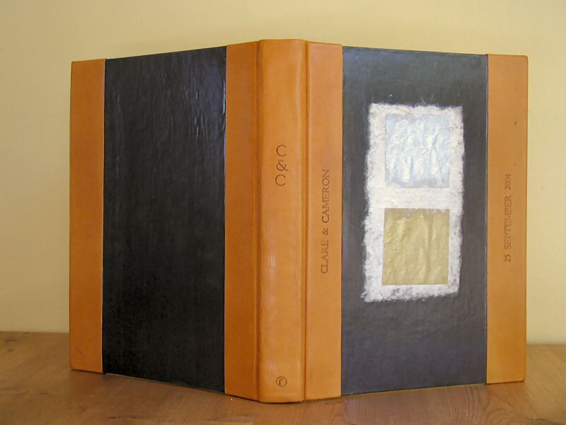
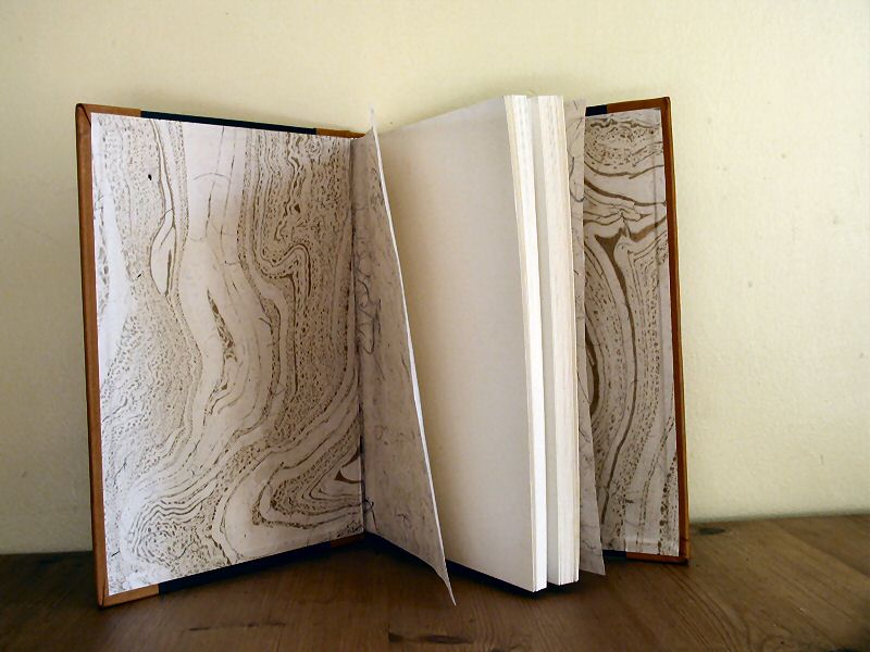
Blind-tooled half binding in golden bookcalf and dark grey paper. Additional design elements from the wedding invitation. Gold and white beaded headbands. Gold marbled pastedowns and handmade Nepalese lokta flyleaves with cornsilk.
I love binding for weddings.
When I heard that Cam and Clare were going to get married, I knew I wanted to bind them a photo album. The only problem was that I've never been to their house and have no idea of their taste. I tried to get some information from Cameron's mother, Martin's aunt Hazel, but came away with no instinctive feel for what they would like. I set up the half binding in gold goatskin, which went with the gold and white headbands. What next?
Then I got their wedding invitation. It was really clever, made up of layers of paper: dark grey on white card, with a rectangle of rough handmade paper glued on, acting as a base for gold and silver squares. Over all that they had a printed piece of acetate with the invitation itself. I thought I could base the design on that, and went hunting for materials in my paper stores. Grey paper, check. White handmade paper, well, something similar. Gold and silver squares, ummm...
But I started picking, and realised that they had used a semi-permanent fixative for their invitations. With a little care, I was able to peel the whole thing apart. So I cannibalised it, using the very white tissue and gold and silver squares from the invitation. I sealed the paper elements of the cover with PVA (sorry guys, no more picking apart).
The marbled pastedowns are a paper I bought on a whim and then wondered what to do with. I love it, but it turns out not to be well-constructed. The gold dust began to come off all over my hands, the paper elements of the book, everything. I cleaned the book off (mostly - there's still at least one fingerprint there), then PVA-sealed the pastedown as well.

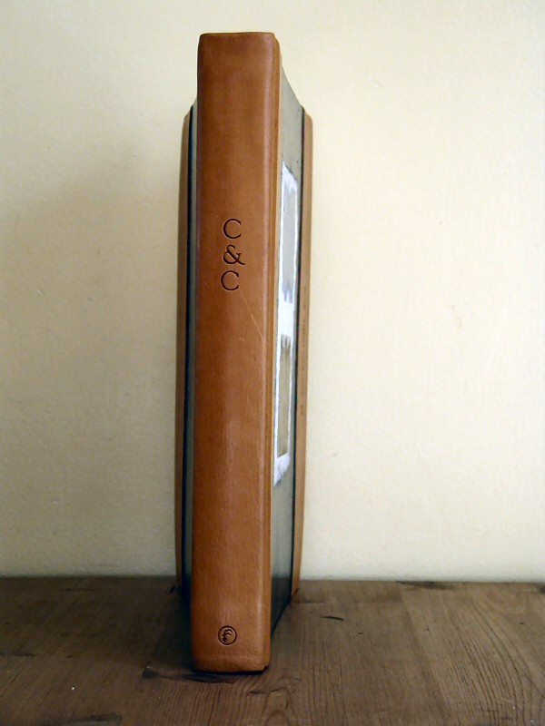 But the best part of the book was the tooling. Rather than use my handle letters, which are the traditional method, I used type in a type holder. This gave the letters good kerning (they line up better than most of my other tooling), but gave me some trouble on the evenness of the colour produced. I had to re-tool the middles of some of the longer words, though I got the line-up close enough. I love the result, particularly the "C&C" on the spine.
I hope they fill it with beautiful photos and enjoy it for years.