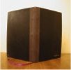
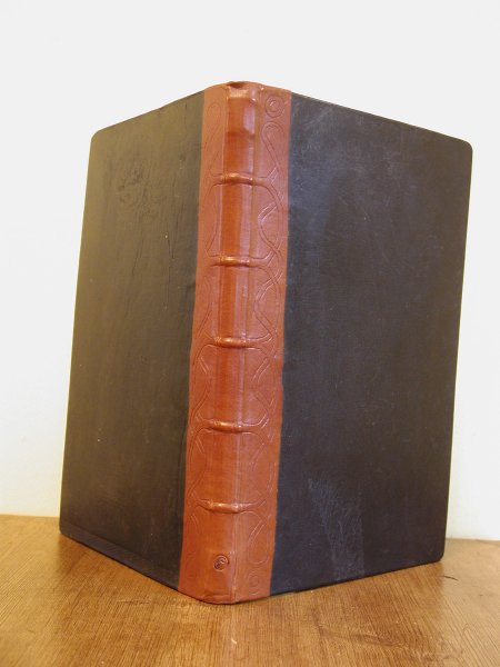
31 x 21.5 x 2.2 cm
I started binding because I wanted an affordable source of really beautiful blank books. Part of that was for my personal use - I tend to carry a small blank book around for random notes and ideas. But part of it was for work as well. I take a "lab notebook" apprach to my job, taking notes on meetings, code I develop, and processes I use. (This is especially helpful since I work part time, and can't rely on remembering everything that happened on a Wednesday by the time I come in on the subsequent Monday.) So making work notebooks is a core part of my bookbinding life
Many people in my office use A4 blank books in the same way I do. My employer buys them from whatever stockist is doing a discount on them at the time, so that they vary from time to time (and site to site). For my own amusement, I've tried to do pastiches of the various notebook styles that are current in the office at the time I bind. When the fashion was for dark blue notebooks, mine was covered in dark blue leather. My next notebook was based on the Black & Red range of books, albeit with exterior cords and Celtic knot blind tooling.
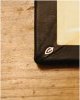
This autumn, the books around the office are all from Guilbert's Niceday range. They have grey spines and dark blue covers. I was particularly pleased with that combination, because I happened to have leather in both those colours, lying around ready to use.
Although the book does resemble the Niceday volumes visually, it is structurally very different from them. Like most cheap office books, the standard ones are hollow-backed. However, I have come to enjoy using tight backed books. I like the feel of the spine as it opens enough to put up with the deeper gutters that go with that structure.
Another difference is in the overall size of the volume. Most standard office books have an overall "footprint" of A4. Since part of this footprint is taken up by spine, you can't carry a loose A4 sheet of paper wholly inside such a book. Starting with my previous book, I have gotten in the habit of increasing the cover size so that an entire sheet can fit inside without fraying. It's only a few milimeters' difference, but the change has made my life easier. This is why I got into bookbinding.
I used to tear down cheap hardcover blank books to get the lined paper for my work notebooks. But then I found a better solution. Many stationery and discount shops in Edinburgh sell single-signature paper-covered lined books. They're just stacks of 20 sheets of lined paper, folded in half and covered in stiff coloured card. The spines are usually fastened by a couple of staples.
The beauty of it is that the staples are just about the same width as the tapes I use for sewing. So not only are my pages pre-printed with lines and pre-folded, they're also pre-punched for sewing. In theory, all I need to do is rearrange the pages into more, smaller signatures and saw for kettlestitches. (In practice, I find that the two staples the manufacturers use are not enough, and I generally have to punch for a third tape in the centre of the spine. But it's still faster than doing all my punching.)
 |
Sitting in a box under my guest bed are some two dozen strips of high-quality grey goatskin, ideally suited for spines on quarter and half bound books. They were spare trimmings, given to me by one of the staff at Hewit's on my first visit. I can't believe how much money Hewit's have made from me as a result of that friendly gesture, which helped cement my loyalty to them and my enjoyment of leather in one fell swoop. |
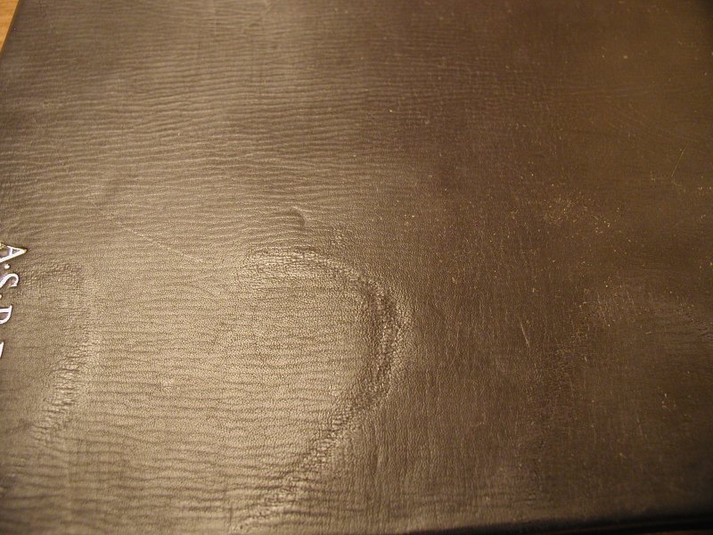 |
The leather I used to cover the boards is a good example of the sort of leather I can get from Hewit's low value shelf. It's blue goatskin with a smooth finish in an attractive colour. No doubt the hides of its fellows went for a very good price, but this particular goat had been badly injured at some point in its life. The leather is scarred and the dye a bit blotchy. No professional would want it for a fine binding, but it suited me very well. A bit of leather food evened the colour out, and the scarring is nothing in comparison to what the book will probably suffer in use. |
 I've been hand-stitching the headbands on my books since the beginning of 2003. But my headbands have always been on a round core, which is a style that went out of fashion centuries ago. (Modern headbands are stitched on an oblong or rectangular core.) This wasn't some perverse old-fashionedness on my part, but rather a practical problem. All my rectangular headbands kept flopping over (if I left the thread too loose) or curling up (if I tightened it too much.)
So how did I finally make it work?
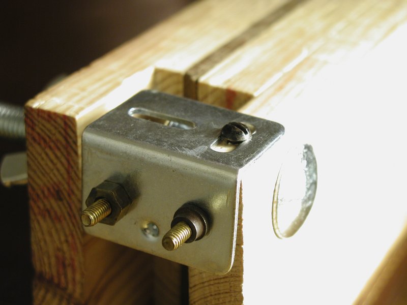 Headbanding requires more hands than most humans have just to keep the threads straight. It's one of the activities that I would like to see an expert do, just to understand how to keep the tension right. In the absence of any such opportunity, I added a nifty little attatchment to my old threaded rod working press.
It's just a small corner bracket from a hardware store, with a couple of small nuts and bolts through two of the holes. But I can wrap the threads once around the bolts to hold the tension even while I headband. It's not easy getting the tension correct - the nuts do tend to loosen and let go of the thread. But even so, it works better than its absence.
I've tried a number of things for headband cores. For round headbands, I tend to use one of two substances - the same cotton string I use to sew on cords, or the thin leather cord that craft shops sell for necklaces. Both work well. Rectangular headbands, though, are harder - the standard recommendation, a strip of leather, is simply not rigid enough. It tends to curl depressingly.
I don't recall where I read the recommendation, but one of my bookbinding books suggested gluing a strip of vellum (the animal product, not the paper) to the leather to stiffen it. This did the trick.
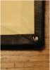
Although I like the blatantly old-fashioned look of sewing on exterior cords, I wanted this book to have a smooth spine. So I sewed it on tapes. However, I also wanted the book to have tight joints rather than French grooves (AKA American grooves). I could probably have managed this with split boards, but I decided to try lacing the covers on with the tapes instead.
Lacing on is the oldest method of attaching hard covers to a book, and is the usual technique when sewing on exterior cords. It involves punching holes in the cover boards and, well, lacing them on with the sewing supports. The supports go from the spine of the book through the cover from the outside in, then through again from the inside out. It's enormously secure and strong, and allows the binder to place the hinge point at the outside of the cover board instead of the middle (as with split boards) or the inside (as with casing in).
Lacing on with tapes turns out to be the same in principle as lacing on with cords, but is rarely discussed in bookbinding books. The one difference I found was in the work required to keep the covers flat and even. Because cords can be untwisted and pressed flat, they only require channels cut in the covers at the start of their threading. By contrast, tapes are already as flat as they can get, and so need channels cut wherever they will lie on the surface of a cover.
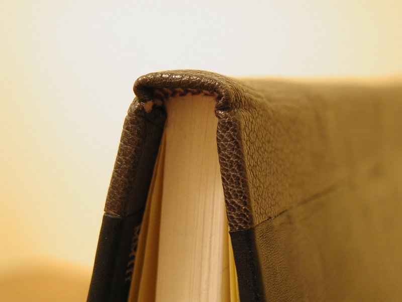 Headcaps are a peculiar decorative structure used to give a tidy visual finish to a spine. I've seen too few of them to judge when one is done well or badly, or to diagnose problems with their formation.
I saw a demonstration of leather covered spines at the the Society of Bookbinders training and education conference. This is the first time I have tried to set a headcap since that time. I think it looks nice, but then what do I know?
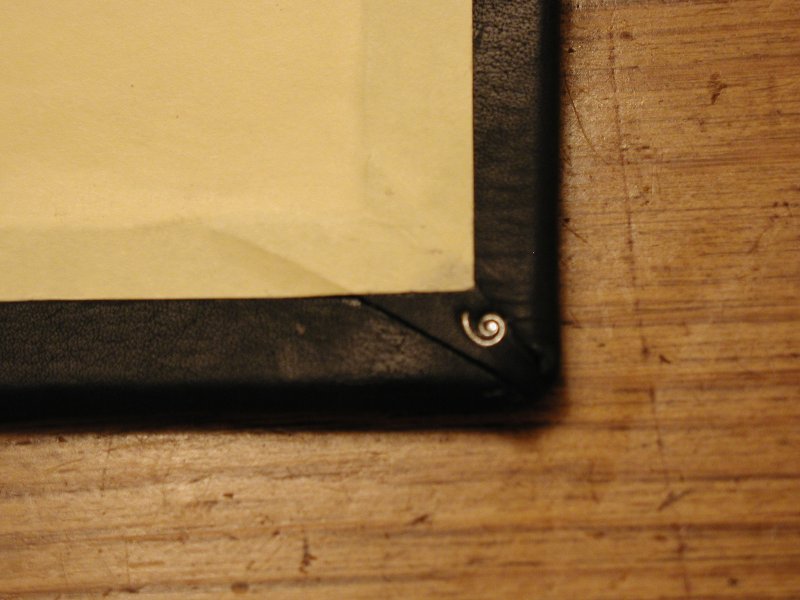
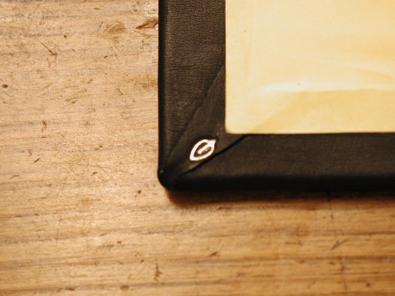
The book, when completed, looked very plain to me. It needed a bit of visual punctuation. Due to time constraints, and uncertainty about whether the blue leather would take glaire, I decided to tool with silver foil.
Although not an unmitigated success (see the Lessons Learned section below), the tooling was fairly satisfactory. It's a bit patchy in places, but that almost looks intentional.
 |
 |
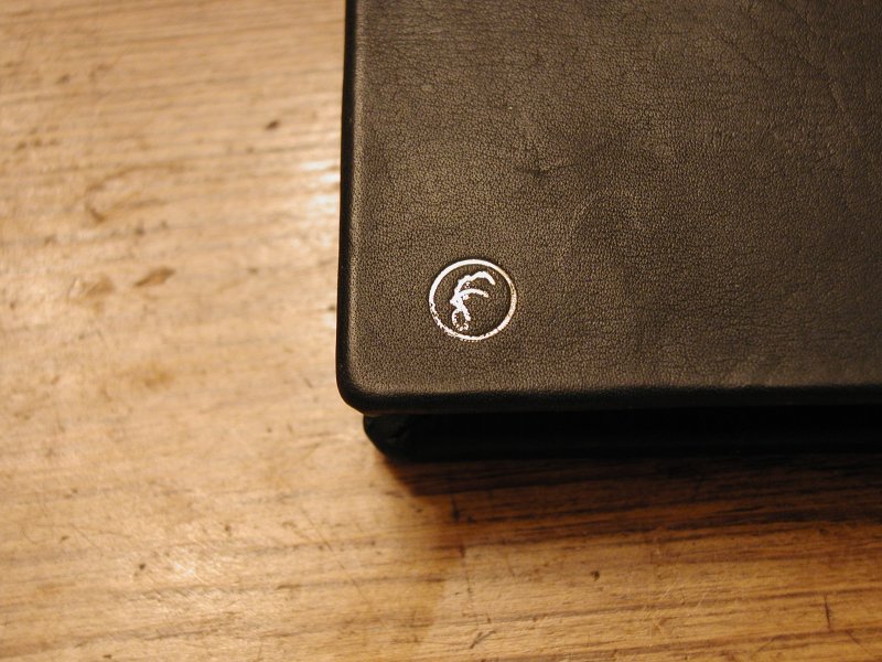 |
I am particularly pleased with the tiny ornaments on the tabbed corners. They add a nice little visual punch to the inside of the book.
 |
 |
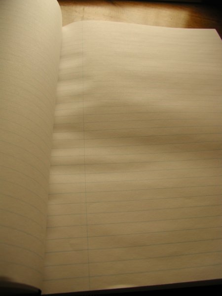 |
Unfortunately, the paper-covered blank books I bought for paper stock this time seem to be cross-grained. This means that the paper grain is parallel to the lines on the paper, and runs horizontally in the bound book. Cross-grained paper is a nightmare to work with, particularly if you aren't expecting it, because the paper cockles and buckles when wet. The pages then cup and stiffen in odd ways. These problems can be dealt with (mostly by keeping moisture to a bare minimum) if you are expecting them. I wasn't, because I didn't test for grain. Silly me. |
As usual, I had some trouble with my tight joints. I have three weaknesses, which the work book displays (albeit to a lesser degree than any other tight jointed books I've done).
 |
The upshot of all of these minor missteps is that the tapes will probably pull away from the boards slightly at the spine edge. In fact, under the right lighting, they already show some signs of it. |
As has happened several times recently, I ran out of time while binding this volume. I ran out of space in my previous book at the end of one week, glued down the endpapers, and didn't start tooling until Sunday night. At that point, I didn't know whether the blue leather would take glaire. Rather than take the time to find out, go through the time-consuming process of tooling properly, I simply used silver foil.
Unusually for my foil tooling, the lettering is not gloopy or over-filled. Rather, I had the opposite problem - much of it is patchy and poorly adhered. I can pretend that this is an "effect", some deliberate attempt to make the book look aged, but let's be honest. The foil didn't take because the tools were the wrong temperature, and because I had used leather food on the book before tooling.
The obstacle to proper tooling is as much psychological as anything else, I think. My perception of the time it will take to tool with glaire includes the time it will take to ascertain whether the leather I am using will work with the process. That effectively doubles tooling time. It's probably a good idea to do a comprehensive survey of my leathers, to see which ones tool well with glaire and which ones do not. Hewit's have a factsheet about leather finishes and glaire, but I'm not entirely sure of the identities of all of my leathers.
At some point, I will have to gather some empirical evidence.